With the dreariness of winter now finally behind us and with warmer weather in our midst, our moods naturally started to brighten up, and that got us thinking about colour and the science behind the millions of shades we see everyday.
Have you ever noticed that people tend to generally be happier when the sun is shining and the weather is warm? It’s no mystery that our long, harsh Canadian winters have a noticeable impact on our moods and our productivity. Notably, what subconscious effects can colours have on our on thinking, and further to that, what impact does colour have on your promotional campaigns?
Saying It With Colour
If a picture is worth a thousand words, then colour has to be good for at least several hundred. Whether you are consciously aware of it or not, colour naturally stimulates our senses and inherently evokes thoughts and emotional responses. According to the Institute for Color Research, humans make a subconscious judgment about a person, environment or item upon initial viewing, and the majority of that assessment is based on colour.
The power of colour is essential to the effectiveness of marketing communication, corporate branding, signage, ads, print and online media, and packaging. Depending on what type of message you wish to convey, the colours you choose can either support and emphasize it, or contradict and detract from your message. Because colour delivers an instant impression that is generally universally understood, colour is very important in conveying a mood or idea which supersedes verbiage or content.
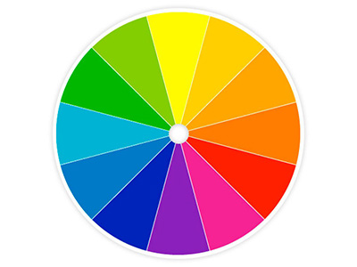
So what message do the most common colours convey?
Black: The colour of authority and power. In fashion, black is one of the timeless shades due its ability to coordinate well with virtually every other shade in the spectrum. When used to design promotional apparel and advertising speciality initiatives, black is effective in purveying a bold statement. The emotional connection that black evokes can be associated
with sophistication, formality, elegance and wealth.
White: Symboylizes innocence and purity. While technically not a colour, as white is the absence of colour, it is considered timeless in fashion as it is light, neutral, and coordinates every other colour. White is especially popular in high-tech products to suggest simplicity and In advertising, white is typically associated with coolness and cleanliness.
Red: The color of love and blood, red is an extreme colour which tends to get noticed before all other colours. When used in apparel decoration red is more often than not employed as an accent. The emotional connotations that red evokes are excitement, passion, strength, aggression and intensity.
Blue: The symbol of peace, tranquility and conservatism. Fashion consultants recommend wearing blue to job interviews because it symbolizes loyalty, stability and trust. Blue is the most common colour used in corporate branding by large multinational corporations. Emotionally, blue is said to cause the opposite reaction as red as it evokes peacefulness and tranquilly.
Green: Green symbolizes nature and is currently a one of the most popular colours used in branding and decorating, mainly due to the shift in environmental awareness. Green is one of the easiest shades for our eyes to take in as it it the most restful color for the human eye, said to improve vision. Green evokes feelings of harmony, health, fertility and growth.
Yellow is the colour of joy and it subconsciously produces a warming effect though to arouse cheerfulness While considered an optimistic colour, it is one of the most difficult colours for the eye to take in, and as a result it can be overpowering if misused or abused as it easily draws attention.
Purple combines the stability of blue and the energy of red and has historically been associated with luxury, royalty and wealth. Currently purple is one of the popular fashion colours for 2011. According to surveys, almost 75 percent of pre-adolescent children prefer purple to all other colours. Since purple is a very rare colour in nature, it can evoke emotions of artificiality if misused.
Orange: Evokes balance and enthusiasm, as it combines the energy of red and the happiness of yellow. To the human eye, orange is a very hot colour, so it gives the sensation of heat. Nevertheless, orange is not as aggressive as red.
Orange increases oxygen supply to the brain, produces an invigorating effect, and stimulates mental activity. It is highly accepted among young people. In fashion and in advertising, the colour orange is very much du jour in 2011.
Obviously within each colour, there are hundreds of various shades which can be used to dictate emotion, with the ones aforementioned being obviously the most common and traditional. When planning out your next promotion, take an extra moment to really think about the colours you are planning to employ and whether or not they serve to reinforce your message (and that of your clients’).