A solid logo design – like every other form of design, graphic or otherwise – needs to be based on a set of principles in order to be effective and memorable. In this article, the key elements to solid logo design are examined.
1. RESEARCH
First and foremost comes research. This first principle is fairly straightforward and it remains the foundation for all subsequent elements that go into sound logo design. Without research, you company’s logo cannot be an accurate reflection or symbol of your organization.
Questions like – Who is your target market? What services or goods does your company provide? What is the organization’s culture? How is your company positioned in the industry versus the competition? How do your clients view the company? – need to be thoroughly examined and answered earnestly in order for your logo to be an accurate representation of your company.

2. SIMPLICITY
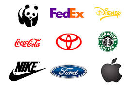
I’m sure you’ve heard the K.I.S.S. cliché before: Keep It Simple Stupid. Stray away from this notion and sadly you will never get it right. A confusing or complicated logo is essentially worthless; trying to covey too much in a design will only confound your target audience and that is the exact opposite of a logo’s purpose. Every effective, recognizable logo which represents a leading global brand shares this basic principle. Although your company may not be a global powerhouse, it’s never a bad idea to study what the “big boys” have done right.

3. FLEXIBILITY
An e fictive logo should easily transcend any media – whether it’s a business card, a pen, a t-shirt, a billboard or a catalogue. In order for this to happen, it is paramount that the design be legible and scalable which why vector graphics are absolute must. Vector graphics ensure that no degradation in image occurs regardless of the size of the design being used. (How many times have your vendors a pixelated JPG of your logo that you want reproduced onto a promotional item?)
A flexible logo will work well at any size it is reproduced as well as across both vertical and horizontal scales. A couple of good ways to determine if your logo design is versatile is to see if looks good in black and white, when inverted, and when outputted as a mirror-image of itself.
TIP: Colour is secondary. Any good designer will tell you that if you are considering a logo redesign, it should first be created in black and white so that you can clearly focus on the concept, shape and focus of the design itself without being distracted by the emotional nature of colour. Your mind can easily be drawn away from the effectiveness of a design if a colour used in the design is conveying another message.
4. STYLE
The use of colour, typography and balance, when employed correctly, are vital to making your logo memorable (which is ultimately what you want).
The style of design you or your designer chooses needs to be suited to reflect the essence of your organization (which is attained through research – see principle # 1). The importance of typography, or “font”, is o en oversimplified. If your logo uses text – either as part of the design or in a tag line – you will probably and that you need to test dozens and dozens of different typefaces before you get it right. Custom fonts are always as good way to go, especially if you really want your logo to stand out. The more original the font, the more easily recognizable and memorable your design will be.
Another element of style is balance. Our eyes and minds are naturally drawn to perceive balance as visually pleasing. Keep this in mind when considering the physical make-up of your logo and be conscious of the ratio your design holds with respect to horizontal and vertical scales. You don’t want a logo which is disproportionately tall or wide as this will almost always become a problem when used in conjunction with other graphics or artwork.

5. CONSISTENCY
Don’t fiddle with your logo once you’ve got it right. It takes a lot of time and work to develop a good design, so once you have it, be sure to use it in exactly the same manner everywhere associated with your company – from cards to price lists to websites to newsletters. Consistency helps establish memorability so it is important to establish guidelines that outline specific rules for pantones, space allotment and size for your logo – and be sure to enforce theses rules at all times.
If you have a third-party who will be working with your logo, ALWAYS insist on final approvals prior to production of any media.

6. CREATIVITY
Combining all the principles into one visually pleasing design is easier said than done. Logo design can be
done well and it can all too easily be done very poorly. There are numerous logo templates out there that you can
copy or buy for next to nothing, however the finished product will almost always reflect the level of design work
that went into it. If you are thinking about a new logo
for your company, don’t be scared to spend money on an experienced designer who is versed in corporate
identity. The collaborative process that a good designer brings to the table will help you navigate the various concepts which need to be explored before narrowing down the right design for your company.
TIP: Your logo doesn’t need to show what product or service you provide.
Need proof?
According to Business Week’s Top 100 Global Brand Scoreboard – which lists brands like Coca-Cola, IBM,
Microsoft, Nike – the following list identifies what these logo designs hold in common:
94% The name does not describe the product sold
90% The by-line tag is not included in the logo
84% The font style is clean and clear
74% The logo design uses only one colour
74% The design uses letters only without the symbol
72% The design is a made-up name or Acronym
66% The design is rectangular in shape
62% The logo design is one word only
54% The logo design includes the trademark symbol
52% The name is 6 letters or less
52% The background is filled and solid.
44% The predominant colour base is blue